PROJECT 4
In the following project, we are asked to define a problem and show our data understanding over a dataset we have chosen.

Introduce the problem
Can a person's BMI categorize their mental health and/or physical health?
Introduce the data
The data I will be using is a house prices dataset that includes fields like Health Disease, BMI, smoking, Alcohol Drinking, Physical Health, and Mental Health. You can view the dataset here!
_edited.jpg)
Clustering
This is a type of unsupervised learning that is used to put data into groups. This type of analysis uses categorization to get data points to specific groups to which they can belong. There are two types of clustering that can be used to implement over my chosen data which are: k-means clustering and agglomerative clustering. For this visualization, I will use k-means clustering.
K-Means Clustering
In k-means clustering is when you pick a particular k-value or clusters you want to have for your dataset next is to pick random points to use as our initial centers. Then, find the distance between each point and the center. After, group all the points to their closest center and recalculate the cluster center based on the data points belonging to that cluster. If clusters change then the distance between each point and center is found again.
Pre-processing the data
1. Check the data- Using the info() and/or dftypes methods to see the datatypes of the different fields in the dataset and I tried focusing on numerical datatypes rather than categorical ones.
2. Next, I wanted to check if there are any null values present in the dataset and if there were not any. So that dataset was already pretty clean.
_edited.jpg)
_edited.jpg)
_edited.jpg)
Data Understanding/Visualization
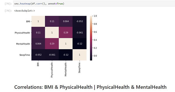
For the k-means clustering model, I am using PCA in combination with the visualization process but first I wanted to see what features have a high correlation within the dataset. So for that purpose, I used a heatmap:
I was able to conclude that BMI & PhysicalHealth and PhysicalHealth & MentalHealth have a high correlation.
After that, I was able to implement the PCA portion first to set up the data for the k-means clustering model.
Now I was able to implement the k-means clustering model with the following code:
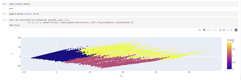
With the K-means clustering model, I do need to use a specific k-value that would work best with the data points. I was able to figure that out by graphing the variance. The variance seemed to slow down at 3 so I decided to go with the k-value being 3. In the code below I defined the number of clusters to be 3 and graphed the k-means cluster.
Based on the K-means graph I was able to see there is a pretty good distinction among the data points so 3 seemed to be good to use for the clusters' amount. So now I am able to see the distribution among the points with the specific amount of clusters, which I analyzed with the following code below:
Then lastly I used a scatterplot to see the clusters grouping the datapoints:
_edited.jpg)
_edited.jpg)
_edited_edited.jpg)
_edited.jpg)
_edited.jpg)
_edited.jpg)
_edited.jpg)
Storytelling
This dataset collects primarily to see the key indicators for heart disease and BMI, Physical and MentalHealth can play a part in that, whether it is an indirect relationship or direct. So, k-means clustering can help see what categories can include people that have Heart Disease.
My Code
You can view the code I wrote for my project here.